If I can make someone smile or perhaps get a smile on MY face when I open my mailbox (which not one day goes by that I don't HOPE to find something FUN popping out of my mailbox) then I think I've done my job and tried to make the world is a BETTER place by making just one person happy! Addresses are sometimes altered for protection so the overall visual of the envelope may or may not be the way it was.

Friday, August 9, 2013

Blessed Beyond Belief

Since Anita doesn't have a Facebook account, I thought I would
document this post here so perhaps she would see it and how much she means to me!
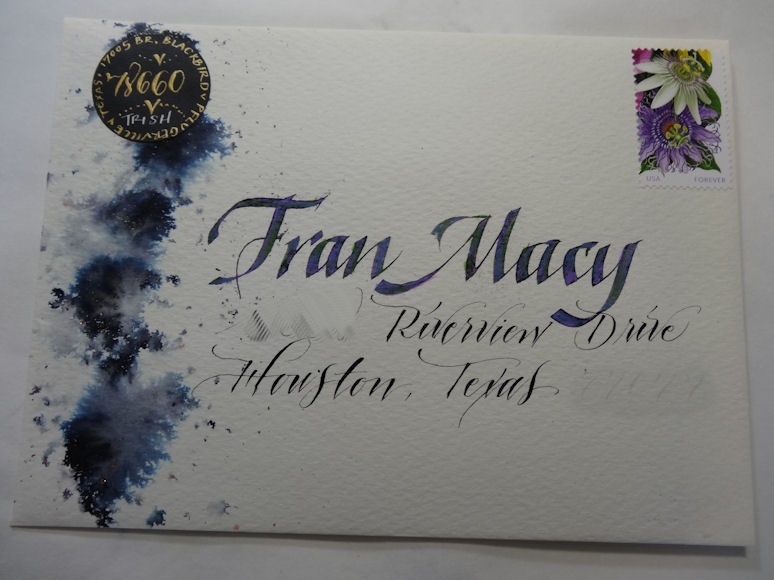
My dear friend and calligraphy comrade, Anita, penned this envelope with class and grace!

This was the card included inside the most beautiful envelope

Sandy gave me this at lunch...

Dearest Kate, with her whimsical writing blessed me with this in my mailbox this week...

Love my friends.... they're the best!

Thursday, July 25, 2013

Black, Paste Paper and webbing spray

Here is a piece of black, Strathmore, Artagain paper with paste paper technique
using heavy body acrylics to get the texture

After it was completely dry, I sprayed it with Krylon
Black and Gold Webbing spray

This is the back of the card.  I really like the affects it makes
Here is a very, jewel-toned piece of paste paper... with the black paper
as the base.... see the webbing spray affect in the photo below


This is the same piece of paper as above..
I think the lighting was just a little different ..
Flash vs. No Flash
Another with just the black webbing spray,
NO Gold

This one has both gold and black

This one just has the gold webbing spray
The only thing I don't like about the spray is
that you have very little, if any control over
where the spray goes.  Sometimes, the
density of the spray is too much or too little and
it's hard to actually have " desired placement" of the stuff.

Envelopes galore....

Using Walnut ink with a parallel pen I wrote Juanda and then
added some doc martin's Bleedproof white for the accents when it was
completely dry

Here is a little closer view

I left the white lines on there to show that it is BEST if you use LINES
if you want your lettering to look good. 

This was a "left over" wedding invitation from my
sister's wedding  few years ago.  I made quite a few of
these "outside covers" with acrylics, a cuttle bug folder and
some elbow grease.  I thought that was just lovely. The
hand created marbled paper for the band adds a nice contrast.

Inside of the card... coordinating colors and the use of some
marbled paper I created for accents.

A birthday card sent to Toni... my shared birthday girl...
This was done on Tyvek paper.. which is the stuff that you
use when you send the USPS envelopes at the Post Office...
Very durable... like plastic and not the easiest to write on...
You can get some really nice, leather type affects, though just by
rubbing some ink or paint on the papera
Altered the address for protection

Trudy... THE SURVIVOR!  A card of encouragement!
Altered the address for protection

Trying out some swash letters that Holly sent me... not real happy with them...

a bookmark inserted into a card for a dear lady: Sharon M.

Sent to Houston with love... using a technique that Barbi Close taught
at the latest CCS workshop...using black in and then spritzing it with water.
Altered the address for protection


To a friend whom was sick.... altered the address for protection

Some needed thank you's to helpful, loving folks at IAMPETH


Sunday, June 30, 2013

Some older envelopes I ran across....

An old birthday card from my pal, Connie (inside)

Outside of Connie's birthday card

Card front...from Jennifer

Coordinating envelope with same colors

And, inside ... same colors and calligraphic hand.

From my dear, Kate.... what style and whimsy she always has.

The "label" on the envelope from Kate

Beautiful "Kate" rendition of a "T"....

Such whimsical attention to detail, Kate B. has.

Kate's LACE letters...

Envelope from Sharon Zeugin... 2007

Envelope from Liz H. '07

Pat P. envelope

Paula W. envie '07

Paula W. envie '06

Monday, June 24, 2013

More July Birthdays!

I surely had fun creating this card with my hand marbled card....
I found a coordinating envelope which had the same colors in my stash, too!

I used some of the scraps from the paper I marbled and adhered them onto the envelope...
I altered view for security purposes of address.... For the lettering, I used my trusty 'ol
Parallel pen which if you have a color cartridge inside of it... you can add another color
and they blend together so well. 


My Aunt Lulu's birthday falls on the FOURTH of JULY every year!
She used to think all the hoop la was for her when she was a little girl!

More hand marbled paper ... creating another birthday card....

Using some of the Barbi Close techniques... I made an envelope and
card to match using little "tiles" created from scribbling black marks
onto some watercolor paper and spraying with water... and adding a little watercolor

The greatest learning curve or "nuance" to this technique, which
I have done in the past, was when Barbi clued us in on how to
make the little squares look more "defined".  She used a rubber
stamp bad to put black on all four sides of the squares. WOW! POP!

One of the sayings inside of a JULY Birthday card! 
Hope you've enjoyed this as much as I did making them all!